Ranking the 5 worst MLB uniforms of 2024 amid jersey controversy
The 2024 MLB season is not too far away and with Spring Training upon us, one of the main topics of discussion among fans relates to new jerseys. The MLB has released a new design for jerseys, and all 30 teams will use the Nike Vapor Premier "chassis" this season.
The material used for the new MLB jerseys is described as a “breathable, lightweight, high-performance fabric that was made from at least 90% recycled polyester yarns.” However, fans think it feels cheap.
With changes being made to the lettering, patches, stitching, numbers and just about everything traditional, fans and players aren't happy. With that in mind, let's take a look at the five worst jerseys of the 2024 MLB season, ignoring the City Connect jerseys, which are another discussion.
5 worst MLB uniforms of 2024
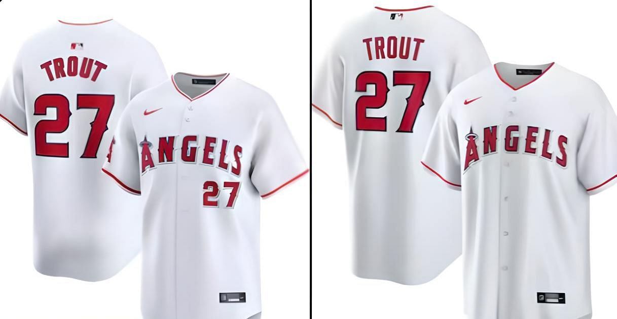
#5, LA Angels
The Angels are set for a tough new beginning with Shohei Ohtani at their cross-town rivals, and their new jerseys have not been well received in camp. Angels third baseman Taylor Ward certainly isn't a fan, and said as much to reporters:
“It looks like a replica. It feels kind of like papery. It could be great when you’re out there sweating, it may be breathable. But I haven’t had that opportunity yet to try that out. But from the looks of it, it doesn’t look like a $450 jersey. So far, thumbs own.”
Carlos Estévez also shared his thoughts, which were:
“When I wear my pants, I feel like I’m wearing someone else’s pants."
#4, Philadelphia Phillies
Multiple Phillies players have had their say on the new jerseys, with Trea Turner telling reporters:
"I know everyone hates them. We all liked what we had. We understand business, but I think everyone wanted to keep it the same way, for the most part, with some tweaks here or there."
Pitcher Matt Strahm told the media:
"Don't fix what's not broken. The looks of it, it just looks different. The names are smaller on the back."
#3, St. Louis Cardinals
St. Louis has seen changes to their jersey and a major one to note is regarding the stitching. The chain stitching is no longer directly onto the jersey and instead is on two patches, which are then sewn on.
Cardinals pitcher Miles Mikolas certainly isn't feeling it, and he told the Post-Dispatch's Derrick Goold:
“I don’t like them. Everyone should write about it.”
#2, Chicago Cubs
Cubs shortstop Dansby Swanson has a Nike endorsement deal and mentioned that he reached out to Nike about the new MLB jerseys. His thoughts were as follows:
“Cubbie blue is its own blue, right? This blue on the uniform is a little bit different than Cubbie blue. So how can we just recapture that?”
A point of contention for Swanson was that the changes detract from the individuality of teams:
“You wouldn’t change the font of, let’s say, the (Atlanta) Falcons. They have a little bit of a futuristic block lettering. That’s unique to their jersey. You wouldn’t then go put that on the New York Giants jersey.
“With some of those things, it’s like this makes a Cubs uniform a Cubs uniform. It doesn’t need to change. I think that they will probably have to end up figuring out a way to kind of go back to what it used to be.”
#1, Baltimore Orioles
Orioles players aren't too fond of the looks of their jerseys, as an unnamed player didn't hold back when speaking to the Baltimore Banner:
“I think that the performance wear might feel nice, but the look of it is like a knockoff jersey from T.J. Maxx.”
The new Orioles jersey was amusingly described as making you "look like a pumpkin out there," and while some may grow to love them, the change is being resisted.
With players and fans unhappy, it will be interesting to see if their comments lead to Nike and the MLB making changes.