Grading every NBA team's "City Edition" jerseys

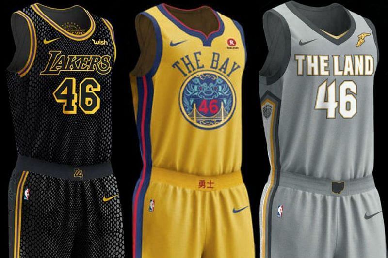
Midway through Wednesday, Nike released the "City Editions" jerseys for a majority of the NBA team. These jerseys were going to be the fourth option jerseys (fifth for a certain eight teams) after the Association ( the traditional home white jerseys), Icon (previously known as road uniforms) and Statement (team's desire to make a bold statement for few big games or rivalries) jerseys.
While NIKE did disappoint one and all by not having any special Christmas Day jerseys, they are certainly giving the team's multiple options - four (five for few teams). Most of these "City Edition" jerseys have a local them while some are quite similar to a design the team previously had.
Let's take a look at the "City Editions" of all 30 NBA teams and grade them:
Atlanta Hawks
They already have one black jersey, however, that one is color combined with red. The neon touch looks really good but are the double lines (above T and under L) really needed? They don't look too appealing to the eye. Doesn't seem to be very creative or thought out either.
Grade: C
Boston Celtics
The design on the jersey itself is that of the parquet floor that the Celtics have at TD Garden. So good thought there but the grey doesn't really go with the green and just feels odd for a team like the Celtics to have. The jersey is quite similar to the team's earlier grey alternate jersey just minus the sleeves.
Grade: C
Brooklyn Nets
Other than the vertical lines, symbolizing the Brooklyn Bridge, and 180-degree chest lettering, this jersey doesn't seem to be very different from the Nets' Icon edition jerseys. They've to the local Brooklyn colors of black and white but in terms of creativity, it isn't great.
Grade: C