IPL 2020: Ranking the jerseys of all the 8 teams
The 13th edition of the Indian Premier League is all set to finally kick-start this Saturday in UAE, after a delayed start due to the ongoing pandemic.
Three-time winners Chennai Super Kings take on defending champions Mumbai Indians in the high voltage opener.
The World's most glamorous T20 extravaganza has offered us some gems when it comes to kits. The majority of the franchises and their designers come up with one or more unique elements and tweaks every year.
As usual, some are adored by the fans while some are panned. We have ranked the jerseys of all the eight teams for this year from worst to best.
8. Kings XI Punjab
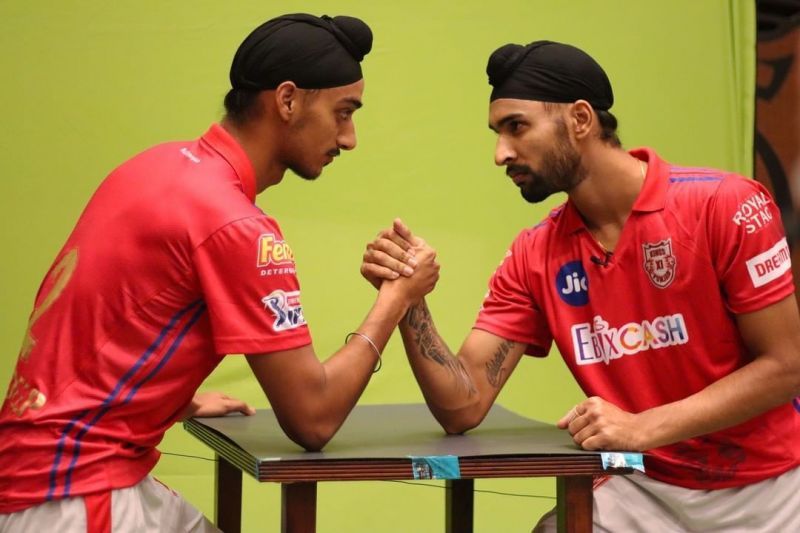
Kings XI Punjab have retained their jersey from last season but with a different sponsor, namely Ebixcash.
The red shirts have always been a fan-favourite, and the recent addition of the twin blue lines is also a nice touch. Despite retaining the uniform's former elements, the dull and dreary pants have, as always, toned down what is a great shirt.
The red and silver combo does look quite good, but the jersey in itself has plenty of scope for improvement.
7. Sunrisers Hyderabad
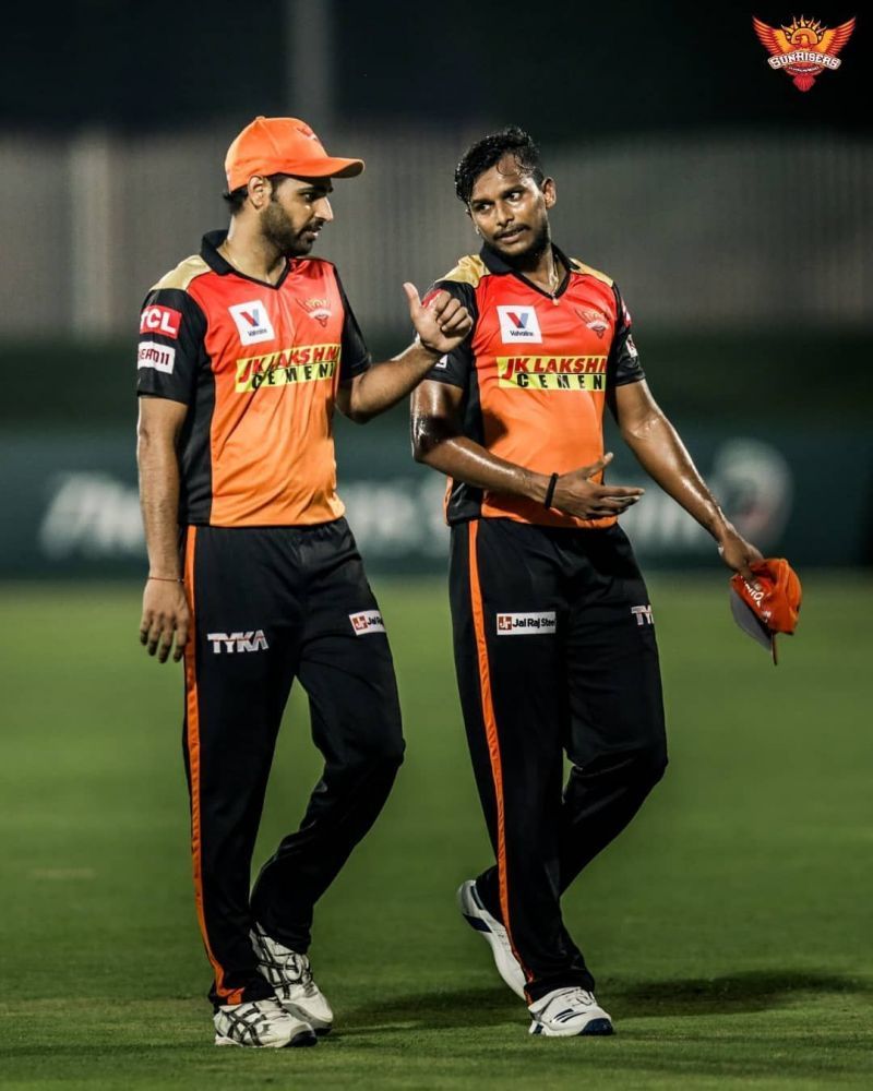
Like Punjab, Sunrisers Hyderabad have also gone with the same jersey, and the only notable change is their sponsor, as JK Lakshmi Cement takes over from Coolwinks.
The Orange Army's glowing sunrise themed kit has had very few changes since its introduction in 2014. The black on the sides and the splash of gold on the shoulders remain. The black pants look great on the field, but the shirts could have used a little more creativity. A team like SRH definitely deserve better.
6. Delhi Daredevils
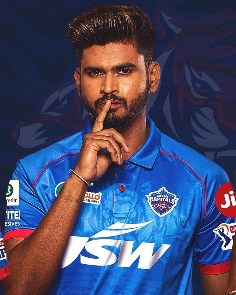
Shreyas Iyer's "Nayi Dilli" have always been a franchise synonymous with blue and this time they have gone for a lighter and brighter shade of the same.
JSW replace Daikin as sponsors this term. The lesser stripes and the three tigers emblem in the background are also a welcome addition.
The red trim on the sleeve cuffs and the red under the collar complete the overall look, paving the way for a fresher and smarter looking jersey.
5. Royal Challengers Bangalore
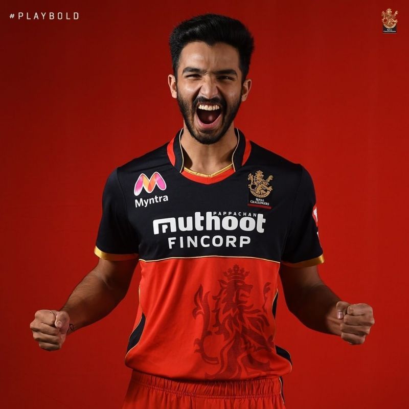
The new RCB shirt is a sleeker version of its predecessors. The shirt sports a new and redesigned logo that was unveiled in early 2020. The golden piping separating the black and red halves, and the gold on the sleeve cuffs, elevate the overall look.
This is probably the best RCB kit since the introduction of black into their colour scheme.
4. Kolkata Knight Riders
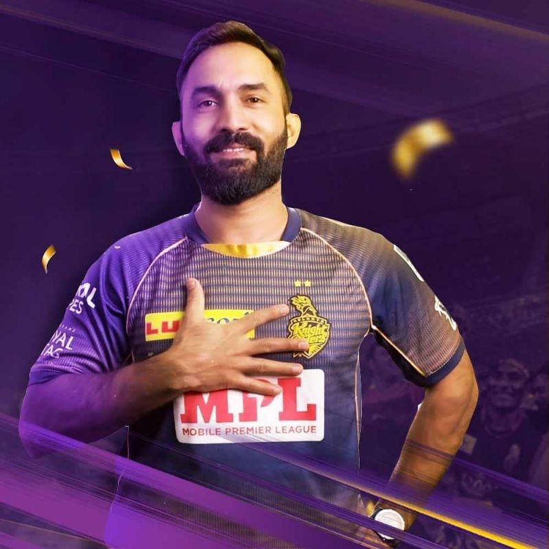
The Kolkata Knight Riders have had some of the best kits in the history of the cash-rich league with the Shahrukh Khan co-owned franchise having arguably the best colour scheme for any T20 franchise.
The MPL logo is a major put off, and if that had been rectified, this purple beauty would have been ranked higher. We have seen better KKR kits, and it is time to move on from the glittery lines.
3. Chennai Super Kings
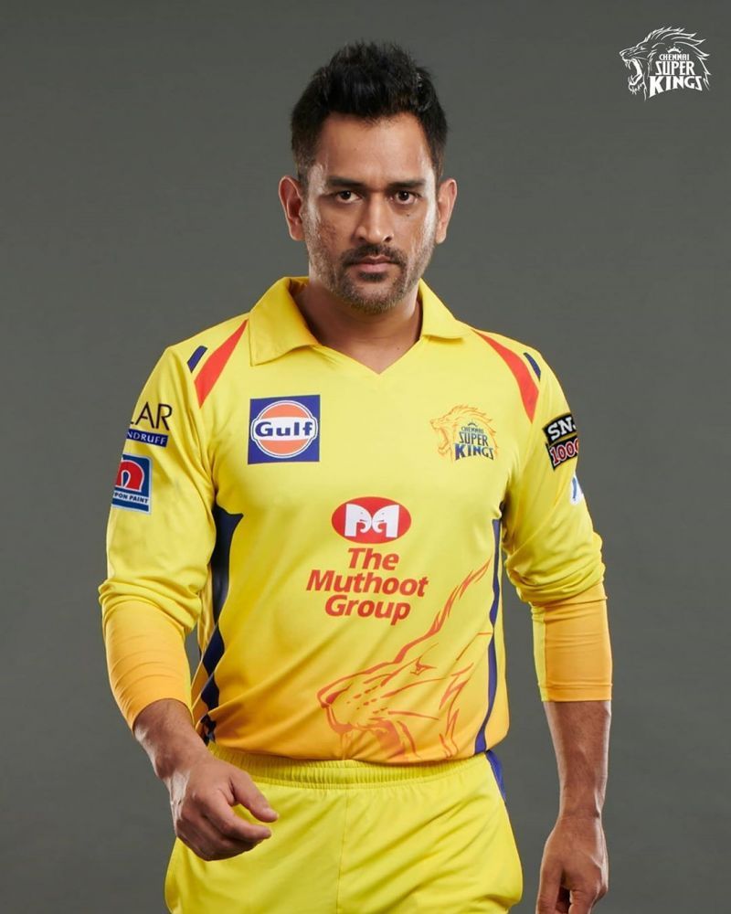
The legendary Mahendra Singh Dhoni-led CSK's bright canary-yellow jerseys are instantly recognizable from a distance.
A jersey that seemed so loud at the start has eventually grown on the fans and has stood the test of time to almost become iconic. The orange lion on the bottom left, the blue on the sides, and the orange hues are timeless.
2. Rajasthan Royals
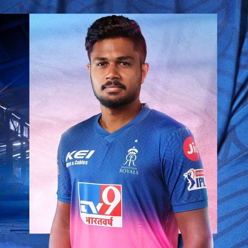
Rajasthan Royals' jersey is one that can grab eyeballs with the utmost ease. The leaf designs in the blue half are appealing. The Royals have gone with a better and darker shade of pink this term, and it perfectly blends with the blue at the top.
Had they complimented this lovely shirt with blue pants then this would have been one of the best kits ever to grace the field in the IPL.
1. Mumbai Indians
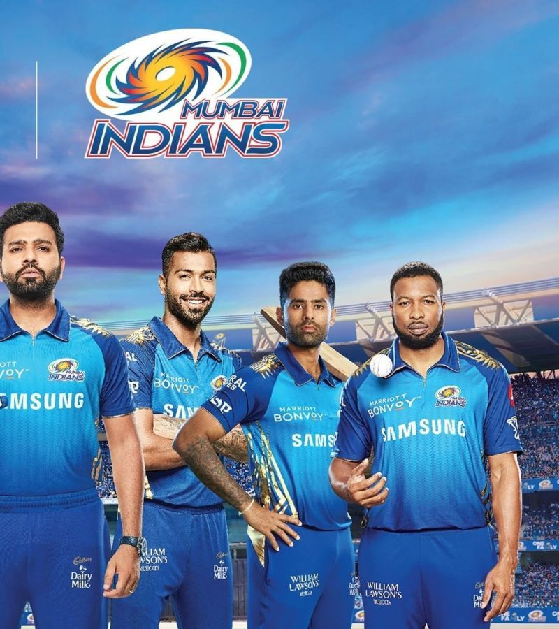
Mumbai Indians rarely disappoint when it comes to shirts, and this time too, the Ambani-owned franchise have come up with an eye-catching kit.
The incorporation of light blue has been a masterstroke, and the glittering golden trims look better than ever. It will be interesting to see if the Mumbai Indians play as good as they look when they take the field on September 19.