5 Of the worst Premier League kits from the last decade

The football kit manufacturing business is probably one of the biggest businesses in the sporting industry, and rightly so due to the huge sponsorship deals that the clubs receive for putting the name of brands on the front of their shirt.
Adidas, Nike and Puma are three of the leading kit makers in football, and they have had a tough job coming up with new and interesting designs every season for the clubs they are affiliated with. They also have the responsibility of retaining the original colours associated with that team.
The Premier League is one of the most-watched sports leagues in the world, and with that gigantic viewership comes extra pressure to exceed expectations of fans ahead with every kit launch. Sometimes the redesigns become a huge hit with the fan-base, while on some occasions, it is a huge letdown.
Today we take a look at the 5 worst Premier League kits from the past decade.
#5 Tottenham Hotspur 2009-10 Home Kit

Spurs have always had a solid jersey with a combination of white and black, but Puma had other plans for the 2009-10 season when they put yellow borders on the sides and below the collars, which extended onto the shorts as well.
Also, for a club with quite some history in England, Tottenham were criticized for putting the name of a betting company on the front of their shirt, which apparently didn't go down very well with the fans.
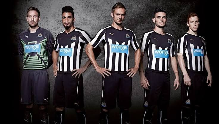
#4 Newcastle United 2014-15 Home Kit

Traditionally, Newcastle United jerseys might be the Premier League's simplest jerseys to recreate - black and white stripes with a crest on the chest. But like the Tottenham debacle, Puma again had other plans which backfired almost instantly.
In the 2014-15 season, the Newcastle kit was designed with a big black patch on the upper part of the shirt with the main sponsor Wonga eating up the majority of the space on the front. The kit was a big disappointment among fans.
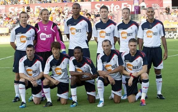
#3 Bolton 2011-12 Home Kit

Reebok probably pulled a big shocker in 2011 when they designed an absolutely asymmetrical home kit for Bolton Wanderers.
The shirt had two huge Reebok logos on both the shoulders and it had two different colours on each sleeve with an asymmetrical design which made it hard to decipher what message was to be sent through the jersey.
This was by far the biggest experiment that was pulled by Reebok ever in the football industry, and they got a very unsuccessful response for their gamble.
#2 Everton 2010-11 Away Kit

Usually, none of the football clubs choose a pink jersey for their official matches, but there have been some clubs who have dared to do it. Juventus have carried the pink kit in style, but Everton were not so fortunate when it came to taking a risk with their away kit in the 2010-11 season.
The Merseyside club also received some flak from its fanbase as the dark-toned pink jersey had a big resemblance to a shade of red, which is the original colour of their biggest rival - Liverpool.
As expected, Everton has never sported a pink jersey ever again after that season.
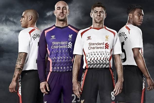
#1 Liverpool 2013-14 Away Kit

The first spot on our list of worst Premier League kits of the last decade goes to Liverpool.
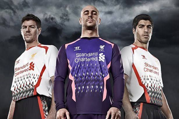
The Reds have always had one of the classiest kits in the Premier League era and before, so their fans are not very used to being let down by the kit manufacturers. But in the 2013-14 season, kit making company Warrior produced one of the worst kits ever for one of England's most decorated clubs.
The away kit was a white and black kit with diamonds featured towards the bottom of the strip, almost like a fuzzy television screen. Warrior revealed that the kit was a throwback to the past to bring out a retro look.
Most definitely, the fans did not connect to the kit and the idea very well, and it certainly tops our list in the worst kit in the Premier League in the past decade.