Best Logos in World Football - Part 3
After part 1 and part 2, here is the last article in this series of the best logos in world football.

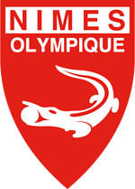
1. Nimes Olympique: A crocodile with a ball in its mouth? Seriously? But nevertheless, the logo is unique in its own way. The contemporary coat of arms of the French city of Nimes consists of a croc chained to a palm tree and hence the logo. Neat!

2. Doncaster Rovers: Earlier having a crest of a local coat of arms, the team playing in the 3rd tier of English football currently has the logo of a Viking which was made by none other than a few college students in the 60s. With a Yorkshire rose on the shield, the club has a logo both classy and medieval.

3. Le Mans FC: Though the French city is best known for its connection with motorsports and most notably for the enduring 24-hour sports car race, the logo of the Ligue 2 outfit is absolutely stunning. The colors of red and yellow blend together amazingly and the horse in the middle just adds to the effect. Sleek.

4. Seongnam Ilhwa Chunma: The team based in Seoul has the logo of a Chumna (Pegasus in Korean), a prominent creature in Korean folklore, flying. The colours of yellow, red and white indicate a positive attitude, passion and purity along with blue which is the color of the sky. The seven stars signify the seven trophies won by the club. Pretty cool, huh? It is one of the most popular clubs in Asia.

5. Liverpool: The Shankly Gates, twin flames in memorial of the 96 who died in the Hillsborough disaster and the Liver bird all fit perfectly into the iconic Liverpool crest. But new kit makers ‘Warrior Sports’ replaced the old logo with the new one which consists of only the Liver bird while they moved the flames on the back collar.

6. Jokerit FC: A joker winking … pretty cool, huh? They played in the 3rd division of Finnish football. You may be wondering – why played and not playing? You see, the joke was on the Finnish club when they were sold to rival club HJK Helsinki and were renamed to Klubi-04 and even had their logo changed. The club plays in the 3rd tier of Finnish football.

7. Bay Area Breeze: Now this logo is certainly one of a kind. It does not represent an animal and isn’t even a theme-based logo. It rather portrays a famous landmark – The Golden Gate Bridge, the pride of San Francisco which also considered to the ‘most photographed’ bridge in the world. The American club was established only in 2011. And yeah, it’s a women’s club!

8. Pune FC: The only team from the I-League to feature in this series, the animal shown here is a monitor lizard, commonly known as a ‘Ghorpad’ in Marathi. During the Battle of Sinhagadh, Tanaji Malasure used Shivaji’s pet lizard Yashwanti to scale the steep walls of the Sinhagdh fort, located about 30 kilometers away from Pune. The color combination of red and yellow denotes aggression and success respectively and blend in amazingly.

9. Orlando Pirates: Now who doesn’t love the ever-jolly ‘Jolly Roger’? When a certain social worker provided the South African club with its first jersey, a new era beckoned the club. How? Well, the jersey the guy gave had the letter ‘P’ on it. This instance gave rise to the skull and crossbones (P … Pirates … get it?). Since then the shape of the crest changed but the ‘Jolly Roger’ remained untouched. The star represents the club’s greatest achievement ever- winning the Champions League in 1995 … The African Champions League.

10. Solomon Warriors FC: Also known as Uncles FC, this club is from the Solomon Islands, a small country in Oceania. The logo resembles a ‘Moai’ which are huge human figures made out of stone, which are found on Easter Island. Sadly, I don’t have any other appropriate explanation meant for the logo, but it was too damn good to be ignored!