Best and worst kits of 2016/17 season

As the start of the new football season draws closer, there are a handful of things on the mind of every fan. Primarily they ponder what signings their beloved side will make, where will they finish next season? Are they destined for the drop or could real success be on the cards?
With all this comes the odd trivial thought though and what strip their club will be parading for the next nine months is surprisingly high on their list of concerns.
A kit can define a season and is remembered down the years for its aesthetics as well as its significance. Therefore, if your side is going to be sporting it every week, it’s important to take notice of your side’s kit. Here’s a look through some of the most chic strips on show this campaign, as well as the kits you may want to divert attention away from...
The Best
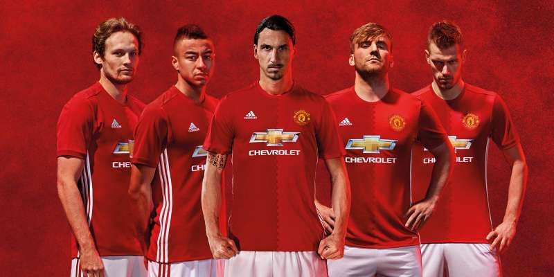
Manchester United – Home Kit
It’s difficult to make a traditional home strip look extra appealing but the Red Devils have incorporated two shades of red into the shirt for this season and the absence of white sleeves or lines reminds us of the United of old. Pogba and Ibra should have no concerns about their appearance when stepping onto the pitch this campaign.
Sao Paulo – Home Kit
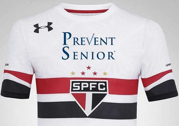
The Brazilians have taken things a step further by placing their crest at the heart of the shirt in front of three stripes of red, white and black. The white background makes for a neat, sleek kit also.
Inter Milan – Home Kit
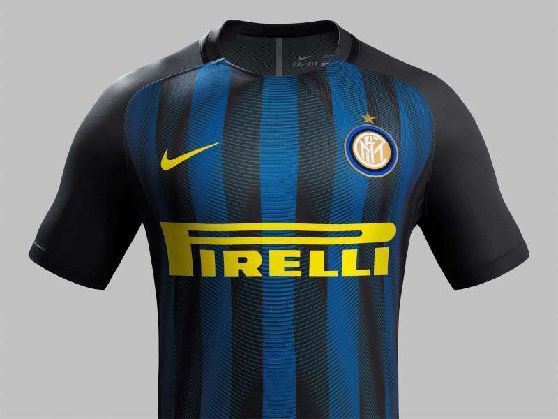
Not all colour contrasts work as well as this, but the use of a yellow sponsor and Nike logo against a backdrop of dark blue and black stripes is simply ‘bellissimo’. It’s simple, traditional and makes good use of the sponsor.
Tottenham Hotspur – Away Kit
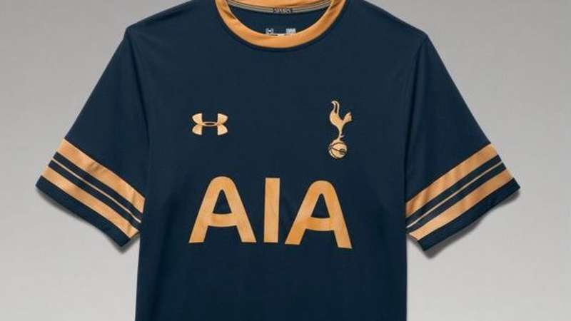
Darker kits may play safe but with this kit, few gambles would look nicer. The seatbelt mocking hurled at Tottenham’s last kit is washed away by this prestigious away strip not dissimilar to the packaging of some vintage champagne.
Bayern Munich – Home Kit
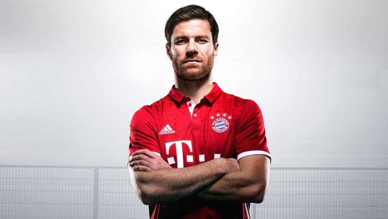
Following a recent trip to the Allianz Arena, I picked up one of these beauties myself and it’s certainly got a lot going for it. The smart collar hasn’t worked so well for other sides (cough, Real Madrid, cough) but here, along with the positioning of the ‘Telekom’ logo and the sleek Adidas logo, it is bordering on perfect.