The effect of kit colours on footballing success

A study (Joris Olde Rikkert, Vincent De Haes, Annemiek D. Barsingerhorn, Thomas Theelen & Marcel G.M. Olde Rikkert (2015) The colour of a football outfit affects visibility and team success, Journal of Sports Sciences, 33:20, 2166-2172) tried to find the effect of the colours of the kit of a football team on the team’s success.

The authors of the paper think that so much attention and energy has been focused on deconstructing the role and effect of individual players and tactics in the sport that the colour of the jersey is mostly overlooked. Drawing a parallel to military combat, they say, “Though ‘football is war’, first stated by the famous Dutch coach Rinus Michels, a team’s kit colours in football is still not acknowledged as a success factor, while camouflage and smart colour use in the army has been acknowledged useful already 100 years ago”.
In an age where marginal gains are everything, there should be no stone left unturned and it’s about time teams took note of this aspect. Kit colours have traditionally been used just as an exercise in communicating brand and traditional values, but could they now even decide your fate in the league? The authors also cite studies that show that red is “directly associated with success” in combat sports, rugby and football. That sounds believable.
It is now a widely practised strategy to have red on your company’s logo if you want success, because that seems to be a common thread among giants that enjoy massive market shares in their respective industries. But it was also found that when the said “success” was normalised to team ability, there was no correlation between red uniforms and winning i.e. weak teams did equally badly and strong teams remained strong. Hence, no direct conclusion can be made of the effect of kit colours on success.
You may be led to believe that an opponent’s jersey colour is down to a psychological tactic of aggression but Rowe, et al. hypothesised in 2015 (Rowe, C., Harris, J. M., & Roberts, S. C. (2005). Sporting contests: seeing red? Putting sportswear in context. Nature, 437, E10.) that the reason could be due to a difference in visibility (peripheral visibility of some colours is more than some others. Imagine trying to spot a teammate in light grey clothing as opposed to one in bright red).
Manchester United used this in their favour while choosing their 1999 outfit. Johan Cruyff had said that black kits were a poor choice as “you do not see your teammates”.
The problem is that studies have been inconsistent, inconclusive and insufficient. The authors set out to see for themselves and attempt to tip the divided opinion one way or the other.
The Hypothesis: “Performance of a football team may be improved by choosing kit colours with high visibility, to improve perceptibility and therefore recognition of teammates. We decided to study the effect of kits’ colour on visual aspects in football retrospectively as well as prospectively.”
The Experiment
The experiment was split into two studies: Study #1 examined the effect of kit colours on visibility using computer animated football players. Study #2 evaluated the effect of kit colours on the performance of 10 professional European football teams over a span of more than 17 years (1995-2013).
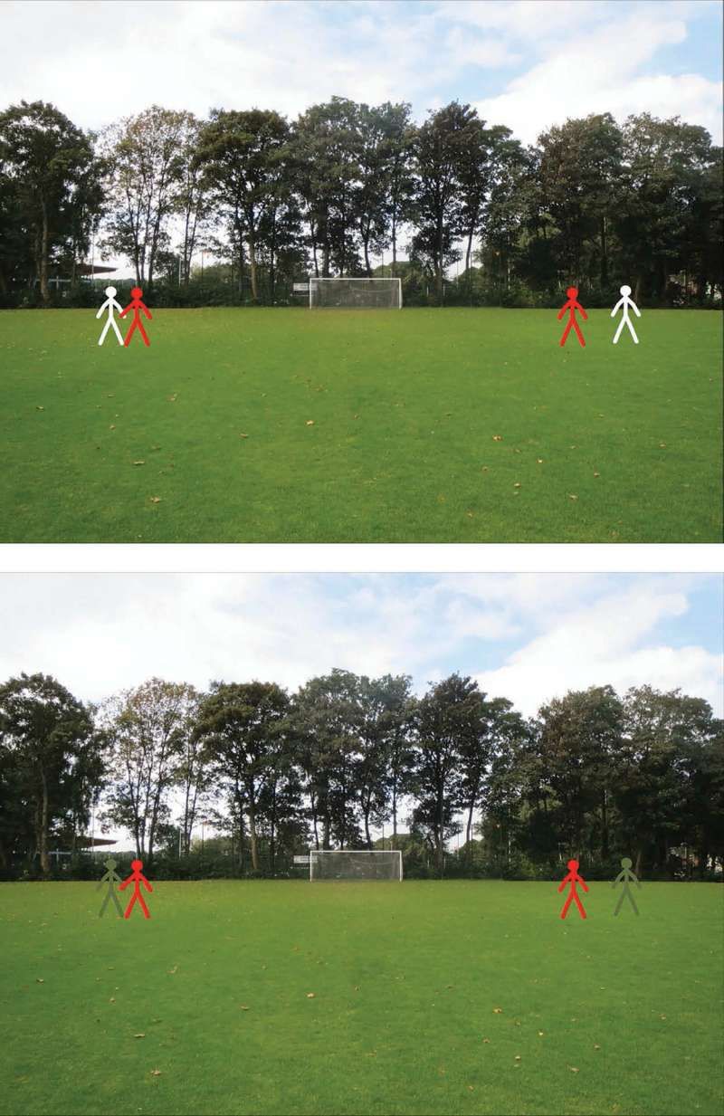
Study #1: Participants – everyday folk – were asked to watch animated players in different jersey colours interact with a “football field green” background on a computer screen. The participants were asked to estimate the distances between these players in different settings.
How correctly they could guess the distances between players in different combinations of jersey colours would tell us which colours were most visible and least misleading for players to play with their teammates.
Study #2: The results of nine English Premier League clubs (Arsenal, Aston Villa, Chelsea, Everton, Liverpool, Manchester City, Manchester United, Newcastle United, Tottenham Hotspur) and Dutch side Feyenoord were analysed. The correlation between a club’s away outfit colours – that changes almost every season – and five ratios of the club’s results (won away/won home; lost home/lost away; points away/points home; goals scored away/goals scored home; goals against home/goals against away) were analysed.
By comparing a club’s results only to its own history of results, the fundamental differences between the clubs (e.g. club strength and budget) were ruled out and hence the results were, in some sense, “normalized to their ability”. Also, deviations in a club’s success per season were accounted for by using ratios between the club’s home record and away record per season.
The Results
Study #1: Firstly, a study showed that white was most visible in both foveal (direct) and peripheral vision against a “football field green” background, while football field green is least visible. “The 18 participants scored 5.2% better in tracking the white players than the average green players.”
Study #2: Two teams showed significant and strong correlation between kit colour and success: Manchester City conceded less goals in away games (as a ratio of away to home games) in high-contrast kits, while Newcastle United conceded less goals and won more points while playing away matches in low-contrast kits. For all the other teams, there was no significant correlation of their away colour with their results.
The Verdict
“We conclude that the colour of football outfits affects evaluations of football players’ positions on the field, with white jerseys resulting in the best location assessment. The kit colour may indirectly influence football match results, warranting more attention to the home and away shirts by managers and scientists.”
If you are the coach or manager of your corporate team, you know what colour to push for!
One of the most important lessons from science is to not take all results literally, but to put them in context and perspective. So here are the limitations of this study:
- You can’t compare the simulation in Study #1 to an actual football field – the complexity with stands; crowds in tens of thousands, almost always in a wall of the same colour (fans dressed in identical jerseys); movement of coaching and officiating staff along the sideline; banners, etc. is way too high
- The green chosen in Study #1 was under daylight and in an amateur team’s ground. The green as seen by players in a top tier game in a professional team’s stadium would have neon lighting and screens with fluctuating displays and hence will almost certainly deviate from the green chosen in this study
- The study only dealt with solid colours on jerseys. Many teams use stripes, as we know. And in the case when a team’s colour was stripes, the “average” colour was taken by the investigators. This approximation was flawed, by their own admission. Stripes makes it complex and fresh studies need to be conducted to understand the effect of stripes or other combination of colours
- Study #2 obviously did not consider a host of factors - budget, injuries, change in coach/management, specific tactics for each opponent, psychological effects such as momentum or the lack of it, over- or under-estimation of opponents’ abilities, mind games, derby environment, to name a few. It’s hard to factor in all of these without interviewing the players or staff in some form of data gathering
- The biggest limitation of Study #2 is that there was no hypothesis to start with. The study was not guided by a hypothesis to prove or disprove. Hence, “take the results with caution” is the advice.