
ISL Logos: Meaning and symbolism behind the Logos of each ISL team
The third edition of the Indian Super League is truly underway, with teams now neck to neck in the points table. With that in mind, we take a look at the logos of the teams and decipher what they mean and represent. Each team logo represents something that is indicative of the culture, history or geography of the city or region where the team is based and also projects the vision of the franchise.
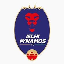
#1 Delhi Dynamos FC
The logo of the Delhi Dynamos has been totally revamped from the flying boot in the first season, to the royal lion this time around. It has been designed to define power, aggression and passion, which is intrinsic to football as well as the people of Delhi. The shape and mane of the Lion has been crafted in the form of a shield, a shape that is seen in various club logos all over the world.
The colours used in the crest are red and blue, where red is associated with strength, determination and desire and blue has been used to represent calmness and responsibility. The darker shade connotes strength, reliability and royalty. The subtle usage of saffron and green, on each side of ‘FC’, which shows the primary focus of the club is to promote and develop football and sport in India.
The letter ‘D’ in the font of Delhi and Dynamos is a forward moving arrow which tells us about the forward thinking, attacking mindset of the football team. The logo also features the iconic Red Fort, a landmark feature of the culture and history of the city.