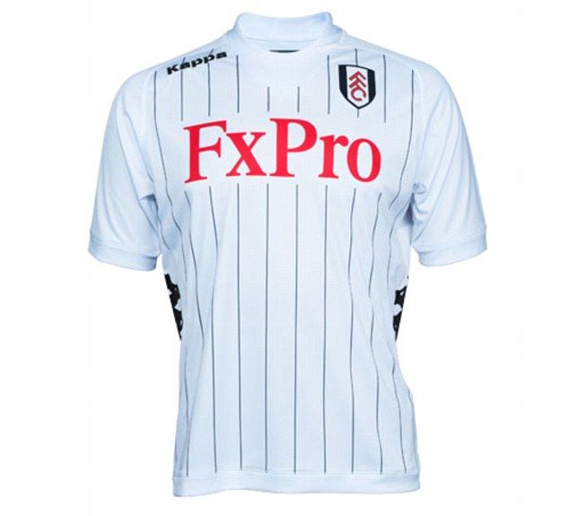
Show your stripes: Fulham Release 2012/2013 Home Kit
Well, there it is! Not too much to write about, but what are your thoughts? In my opinion, I really like it. Stripes can be very overpowering and distracting, but the pinstripes here are clearly not the case. It’s designed in such a way that the stripes are NOT the dominating part of the jersey, the logo and sponsor still dominate. They’re crisp and clean, and I like how they combined last year’s plain white look with the change of the pinstripes. I know some still wish they stuck with last year’s, but that’s no fun!
Also, what’s gotten into Brede Hangeland and modeling? He’s rockin this home kit pretty well now. Guess he has a career after footballing is done!


![]()