5 greatest GTA logos of all time
GTA logos are among the most iconic logos in the entertainment industry. Rockstar Games has been using the current variant since 2001 while only changing the name of the title for different installments. Nonetheless, the Grand Theft Auto logo itself has become a brand and is widely popular to date.
This article lists five of the greatest GTA logos of all time.
Note: This article is subjective and only reflects the writer’s opinions. The listing is not in any order.
Five of the most impressive GTA logos of all time
1) Grand Theft Auto Vice City
GTA Vice City undoubtedly has one of the most creative logos in the entire Grand Theft Auto series. Rockstar Games used a combination of neon pink and white colors to design the logo. This combination perfectly represents the 80’s vibe and aesthetic, which is also portrayed in the gameplay.
The font style of the name ‘Vice City’ is also iconic and close to fans’ hearts. While the actual designer and font name of the logo are currently unknown, many believe that it was hand-written by Rockstar’s designers.
2) Grand Theft Auto San Andreas
While the Grand Theft Auto Vice City logo is the most creative one, the GTA San Andreas logo probably alludes to more fans as it is widely considered the most nostalgic logo in the franchise. The logo is one of the main reasons why San Andreas is still remembered to this date.
Since the gameplay portrays hoods and gangsters of fictional Los Santos, the logo was also designed as a gang icon. GTA San Andreas was a major project of Rockstar Games in the 3D Universe and the logo perfectly matches the vibe as it is a little complex and decorative.
3) Grand Theft Auto 5
This may be a hot take, but Grand Theft Auto 5’s logo is the best-looking GTA logo to date. Before Rockstar Games revealed the final version, there were rumored to be three other beta variants.
While there are a plethora of crazy details in Grand Theft Auto 5, the logo also has some interesting details. The official version uses dark green as the primary color, which is also associated with money (the Dollar bill). The 2013 title primarily focuses on making money through various crimes, and the green logo design perfectly portrays the message.
4) Grand Theft Auto: The Ballad of Gay Tony
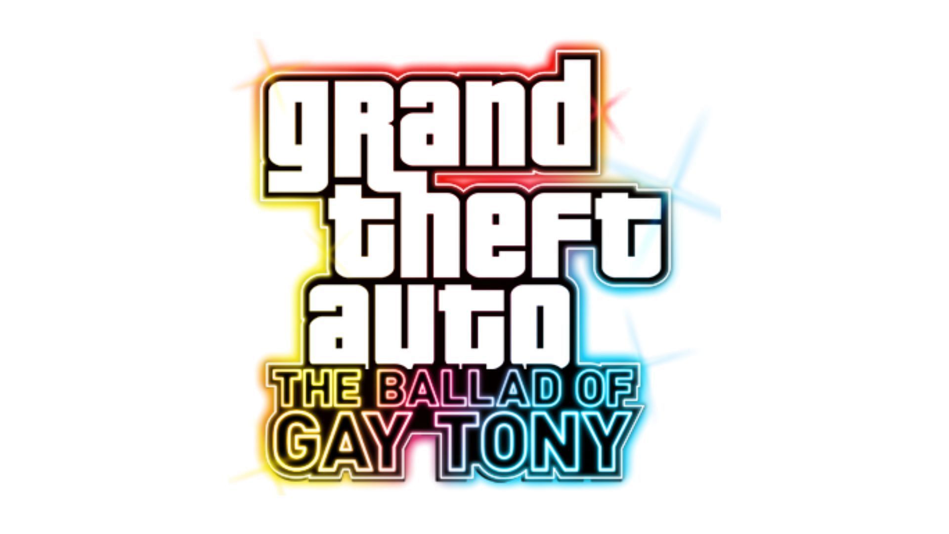
While GTA 4’s logo did not impress fans much, Rockstar made a banger logo for The Ballad of Gay Tony. The story DLC is one of the main reasons why you should play GTA 4 in 2024. The logo uses various neon colors filled with shining effects to portray the disco-centric life the protagonist lives. Moreover, the in-game graphics are also brighter similar to the logo.
The shining colors of The Ballad of Gay Tony attract fans more compared to the bland Grand Theft Auto 4 logo. Moreover, Rockstar also gave it a small disco-themed intro music.
5) Grand Theft Auto 6
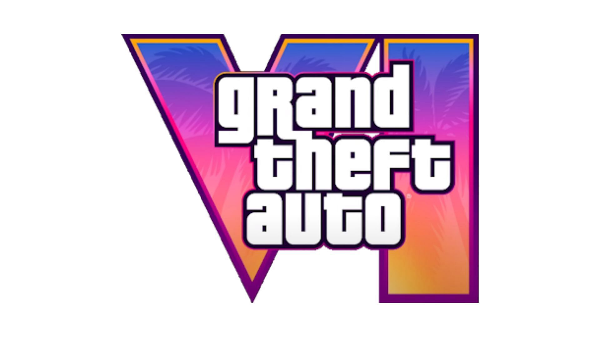
Rockstar Games revealed the GTA 6 logo after 10 years of break. During this time, the community created various fan-made logos, and some of them became widely accepted. However, the official logo became the standard after December 2023.
Grand Theft Auto 6’s logo feels like a fresh start after a long hiatus. It has the iconic pink shade and palm trees referring to Vice City. Fans are now waiting to see whether the gameplay justifies the logo design.