3 throwback helmets that should not make an NFL comeback

Back to the future is the way forward for the NFL, or so it seems. The league announced this week that it would allow teams wearing throwback uniforms to sport alternate helmets in 2022.
The announcement had NFL fans scurrying over to social media to reminisce about their favorite helmets from years gone by. Nostalgia, though, is a powerful thing which sometimes leads us to view things through rose-tinted glasses.
While some throwback NFL designs should most definitely be brought back next year, others... less so.
Here are three throwback helmets that should stay in the past.
#3 - Baltimore Ravens, 1996-98 seasons
The Baltimore Ravens debuted in the NFL in 1996 after Ravens owner Art Modell controversially moved the franchise from Cleveland. As part of the NFL’s settlement with the city of Cleveland, Modell was required to leave the Browns' history and records in Cleveland for a replacement team and personnel that would resume play in 1999.
After a fan vote, the Baltimore Ravens were born. The name was an ode to Edgar Allen Poe’s poem, “The Raven,” since the renowned writer was buried in the city.
The uniform colors were a combination of purple and black but it was the helmet which really stood out and not in a good way. The team’s first logo featured a winged “B” to represent the city. It was encased in a gold shield that bore the team's name along with more wings on the outside.
The issue was that the logo displayed on the helmet was WAY too big, making the design a little too busy and a real eyesore. Thankfully, the Ravens moved on from the logo in 1999.
#2 - Green Bay Packers, 2010-11 NFL season

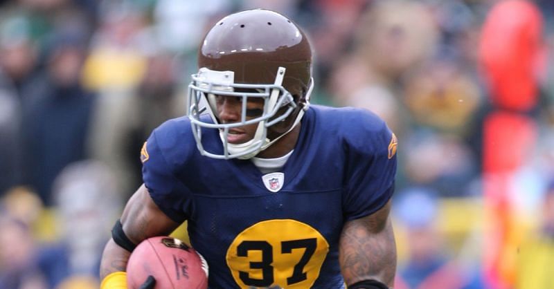
Back in the 2010-11 NFL season, the Packers decided to deviate from their classic uniforms and pay homage to one of their teams from the past. The decision to pay homage to the 1929 Acme Packers squad was most definitely polarizing.
Aaron Rodgers and his teammates ran on to Lambeau Field wearing a navy blue jersey with light brown pants, navy blue socks and a mud brown helmet.
The solid brown helmet was the color of you-know-what and has to go down in NFL history as one of the least flattering designs ever worn during a game.
Should the Packers run it back, the broadcast would have to be in black and white. Otherwise, the sheer number of memes would simply overwhelm.
#1 - Tampa Bay Buccaneers, 1976-1997 NFL seasons
This will surely be a controversial pick, but hear me out. The Tampa Bay Buccaneers' creamsicle uniforms have seen a resurgence in popularity recently, possibly due to reverse psychology. That's the only explanation.
The Bucs wore a variation of these white, red and orange uniforms from their inaugural season in 1976 right through 1997. Seven-time Super Bowl-winning quarterback Tom Brady is a good-looking man, but not even the GOAT can make this work.
The helmet design is probably the best part of the creamsicle design. It features “Bucco Bruce”, a buccaneer with a blade in between his teeth. But for the Bucs to wear this helmet they have to match it with the white, red, orange stripe uniform. Best not open that can of worms.
For all the Bucs fans clamoring to see the team wear this uniform , remember this - Tampa Bay didn't pick up any silverware in this kit. Nada. Nothing.