5 redesigns for WWE Universal Championship title belt

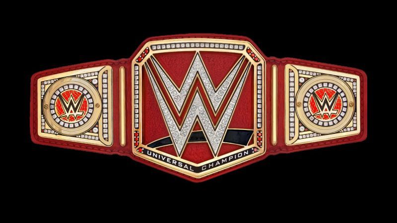
It's been over a year since the WWE Universal Championship was revealed to the public at SummerSlam 2016, where it was immediately made fun of for being a pretty ugly design to the point where that overshadowed Finn Balor's win to a certain extent.
Since then, WWE has made no efforts in changing the belt's design, so clearly, they like it enough to have ignored the backlash.
Thankfully for them, some of that has died down and people aren't as upset about it as they used to be—possibly because the current title-holder is Brock Lesnar, which means we don't get to see it as often as we would if someone on the normal roster were defending it on a more regular basis.
Nevertheless, that doesn't mean the title isn't still something that could use some tweaks to make it look better.
With that in mind, here are some ideas of how WWE can change just a few things down the line to make the Universal Championship belt much more aesthetically pleasing—at least, from my perspective, since all tastes are subjective.
#1 Keep the WWE logo standardized

My problem with the title is primarily based on one thing: too much red.
The design itself is something that likely wouldn't change, as the WWE Championship, Raw Women's Championship and SmackDown Women's Championship all follow the same pattern, so when making changes, you have to keep that in mind.
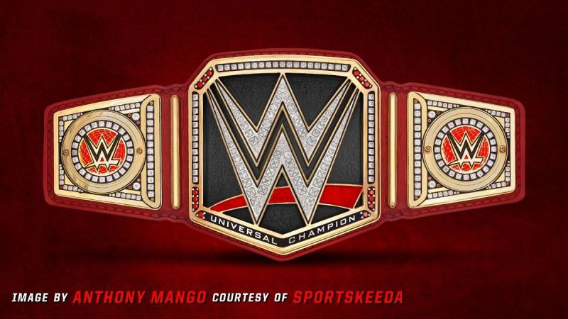
The simplest, easiest way to have a more uniform title design is to change the swoosh under the W to be the standard red one that all three other titles have and to put a black or dark grey background behind the W to make it pop.
Then, for this to stand out, the red strap would be different than the typical black strap the WWE Championship has, but it wouldn't be an overkill of red.