WWE vs. AEW: Which company has the better overall presentation?

For years, WWE was the clear-cut winner in the world of professional wrestling when it came to production. Even during the Monday Night Wars era, when they were literally competing against a TV and media giant, they still managed to have a better visual presentation than WCW.
Then along came AEW, ironically on those same Turner networks that used to air World Championship Wrestling, and they have changed the game quite a bit. Their colorful optics and creative sets have shown they have a flair for excellence in being visually pleasing to the audience's eye.
While both companies present top value in terms of their arena sets and crisp video packaging, the overall feel of WWE and AEW is entirely different. Both promotions spare no expense when it comes to putting together their programs, but they do it in very contrasting ways.
WWE has long been the industry leader in this category, but they are also not afraid to experiment with their look
Longtime WWE producer Kevin Dunn gets a lot of flak on the internet, and rightfully so at times. But one positive thing you can say about him is that he helped innovate how the presentation was improved in the 90s.
Working alongside Vince McMahon, the production team ensured that anything with the WWE logo slapped on it became much slicker and moved faster. Even today, you see constant tweaking of intros and lighting, along with changes in format. It's often subtle but still noticeable.
In recent months, they have also added graphics that virtually jump onto the screen when a particular performer's intro plays. They advanced the concept even further by adding lightning bolts around Xia Li as she does her entrance.
There's also the rather disturbing image of colorful doves flying out of Riddle whenever he kicks his flip-flops off. To be honest? It's kind of weird.
So you win some, and you lose some... At least they are experimenting with new ideas over at WWE headquarters. From a fan's perspective, you can give them credit for never being complacent.
All Elite Wrestling's production value is based on variety and creativity
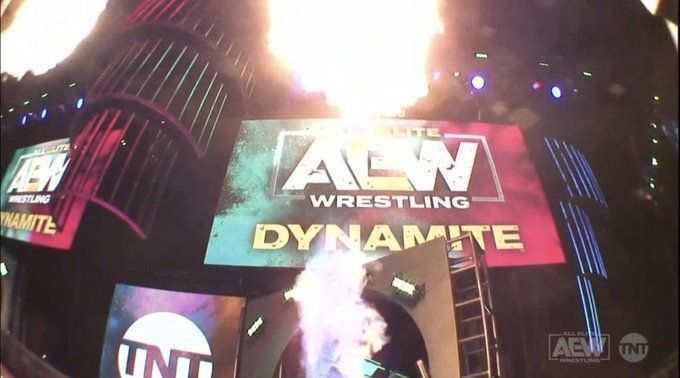
AEW has done a great job in tying its sets to match a specific event or city. While RAW and SmackDown always tend to have the same environment, Tony Khan and his team have mixed things up with a particular location or a special card.
Often, the outdoor setting of Daily's Place is enough to give AEW its unique feel. But when you throw in all the designs they have used, from the giant poker chips at Double or Nothing to the surfer set for Beach Break, it's been very original in terms of visual presentation.
Both companies are constantly making changes to their settings. The fantastic look of their premium events is a testament to that. Both WWE and AEW have taken it to a new level in terms of the way we watch wrestling in 2022. The only question is, who does it better?
What is your favorite wrestling show to watch on a regular basis? What sets it apart? Please share your thoughts in the comments section below.
