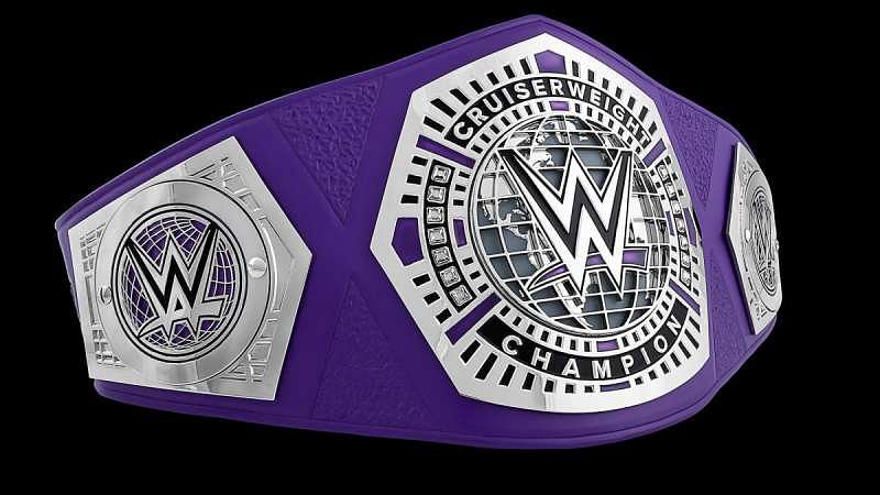
WWE News: Minor change made to the WWE Cruiserweight Championship belt
What’s the story?
As the self-proclaimed ‘King of the Cruiserweights’ Neville and Tony Nese prepared for their tag team match on tonight’s Raw, a very small but significant change was noticed in the WWE Cruiserweight Championship belt.
Fans noticed the difference when the WWE Universe tweeted a picture of the pair before heading into action. The WWE logo has been changed from purple to red on the title belt.
Are the #KingOfTheCruiserweights @WWENeville and the #PremierAthlete @TonyNese on the same page heading into tag team action on #RAW? pic.twitter.com/FptoKPX5hb
— WWE Universe (@WWEUniverse) February 28, 2017
In case you didn’t know...
The Cruiserweight division’s branding is markedly different from the rest of the Raw brand with the predominant colour being purple. Even the ropes around the ring are changed to the colour when the Cruiserweight talents perform on Monday Night Raw.
The title belt used to be entirely purple with steel and black detailing but a slight alteration has been made recently.
The dash under the WWE logo which used to be purple, in keeping with the aesthetics of the rest of the belt has now been changed to red like the conventional WWE logo currently in use.
The heart of the matter
While the change in design is ever so slight, it goes to show the kind of head space the WWE is in. The change in colour seems to be an attempt to standardise the belt and make it look like a more organic part of the entire promotion.
What’s next?
Now that the Cruiserweight belt has been altered, it is possible the other belts might be in for a makeover. The WWE logo exists with minor changes on every belt and Vince McMahon and co. may be trying to give all the titles a uniform look.
Sportskeeda’s take
While a uniform brand image goes a long way in cementing the WWE’s presence, the purple dash really did look better on the belt than the new red one. The new change creates a jarring effect that the WWE could have done without, as it seems aesthetically unnecessary.
Send us news tips at fightclub@sportskeeda.com
